mObywatelidentity confirmation process
mObywatel (mCitizen = mobile citizen) is mobile ID app developed by Polish government.
In-app identity confirmation was reported as a repeated problem for many users.
Client
- Ministry of Digital Affairs
Services
- UX evaluation
- Generative research
- Collaboration with programmers
- Interaction design
- Lo-Fi wireframes
- Evaluative tests
Results
- Improved usability of identity confirmation process.
- Improved searchability of right confirmation method.
- Improved visual consistency.
Primary function of mObywatel mobile app is displaying documents. But the key process is identity confirmation, i.e. proving that "it's really me, citizen such & such", and I have the right to download my documents and data.
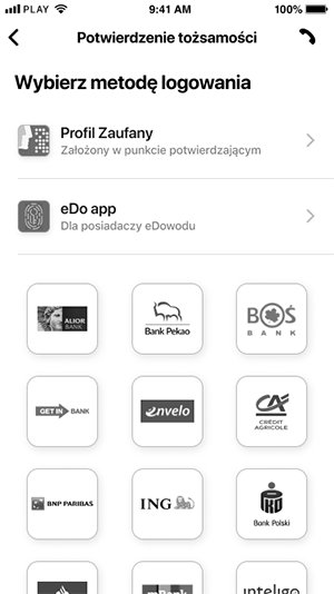
Most of users confirm their identity with Trusted Profile. This process is designed and maintained by outside partners, and is only displayed as a mobile website in-app.
Default version of this site, used to access online services offered by government across various platforms, was causing several problems for mObywatel users:
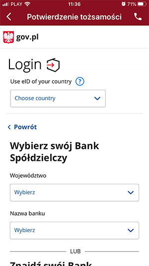
- Glaring differences between UI of the site and UI of the app caused the feeling of being "ejected" from the app when user entered ID confirmation process.
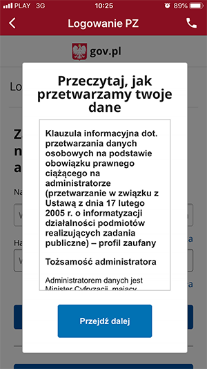
- GDPR clauses and other info (including ads) were displayed on layers covering login form, disrupting process.
- Unimportant for mObywatel users gov.pl header was taking up precious space on the screen.
- Links for ID confirmation via banks' services (one of popular methods for Trusted Profile login) were "hidden" under the button, which in smaller screens was pushed below the screen's edge.
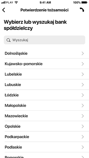
- Search form for one of bank's categories prioritized poorly designed drop-down lists instead of search box.
- The site displayed irrelevant in app's context functions and informations (e.g. very large footer).


With the help of the team I designed more friendly, more functional UI for the website, and Trusted Profile's team agreed to implement our design (only for mObywatel users).
New version of the site:
- is visually consistent with the app;
- is devoid of all irrelevant functions and information;
- allows to easily choose preferred method of ID confirmation;
- has legible, informative headers;
- displays "last used method" next time user needs confirm their ID;
- has redesigned search form for banks with user-friendly fullscreen list of banks (divided by province).