mObywatelimproving screen recognition
mObywatel (mCitizen = mobile citizen) is mobile ID app developed by Polish government.
One of my first tasks in mObywatel team was to improve usability of screens which users see directly after registration: homescreen and list of documents they can download.
Client
- Ministry of Digital Affairs
Services
- UX evaluation
- Generative research
- Collaboration with programmers
- Interaction design
- Lo-Fi wireframes
- Evaluative tests
Results
- Instant recognizability of key screens.
- Instant comprehension of possible actions.
- Improved visual consistency.
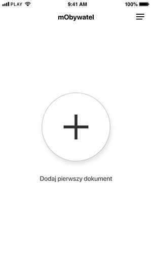
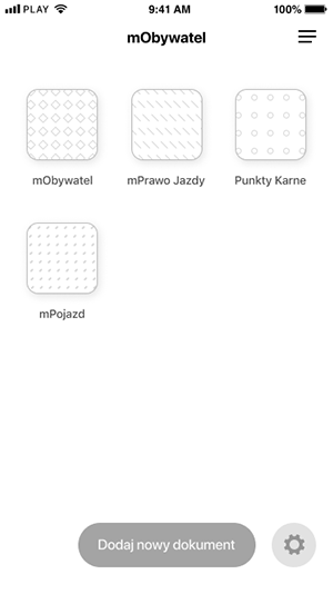
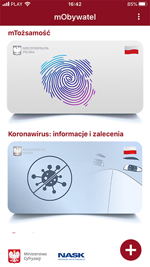
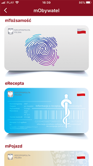
In former app version list of downloaded documents (homescreen) and list of remaining documents were indistinguishable at a first (and second) glance.
Empty homescreen in turn displayed an animation - carousel of documents - so all 3 screens looked really similar.
After testing few designs with small amount of users, we chose following solutions:
Empty homescreen now has only one icon - big "plus" sign with "Add document" label - prompt to one, unequivocal action.
Homescreen with added documents has familiar form of grid of icons, or list of icons with bigger labels (optional setting for visually impaired). Button "Add document" has specific shape and clear label.
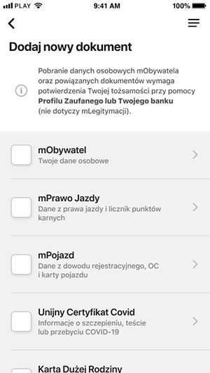
List of documents you can add looks evidently different than homescreen. It has legible, informative title, disclaimer about necessity of identity confirmation in order to download document, short descriptions of documents.
Thanks to these changes users immediately know:
- where they are;
- how did they get here;
- what can they do.