
Trimtab BPMweb app redesign
Trimtab offers advanced app for Business Process Management (BPM). The app enables managing documents flow, timesheets, sells, customer relations etc.
I was asked (as an outside consultant) to redesign visual layer of the app, to make it look more contemporary and appealing.
Client
- Trimtab
Services
- UX evaluation
- Generative research
- Collaboration with programmers
- Functionality design
- Interaction design
- Lo-Fi wireframes
- GUI design / Hi-Fi
- Evaluative tests
Results
- New, visually consistent interface.
- Clear, rational hierarchy.
- Consistent, intuitive navigation.
- Responsive docs and forms.
- New functionalities.
Evaluation
Even preliminary evaluation showed, that during the years of growing application accumulated UX debt, even some critical errors. Some of detected problems:
- fuzzy hierarchy & confusing navigation;
- lack of contrast & differentiation
(e.g. tabs looking like buttons, buttons looking like text-fields); - incoherent use of tools
(e.g. different buttons for the same functions in the same context, identical buttons placed in different places of the screen); - crowded, illegible data;
- lack of RWD;
- incoherent use of colors & icons.
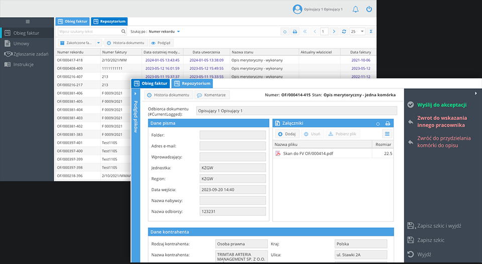
After detaled evaluation, surveying stakeholders, clients and small group of users, we decided to conduct more thorough redesign (screens below*).
New project
New project delivers:
- subdued color scheme enables better contrast for data and content;
- clear hierarchy;
- consistent navigation;
- new functionalities
(e.g. basic task management, advanced search, document preview); - responsive forms;
- open documents are accessible from every place in the app.
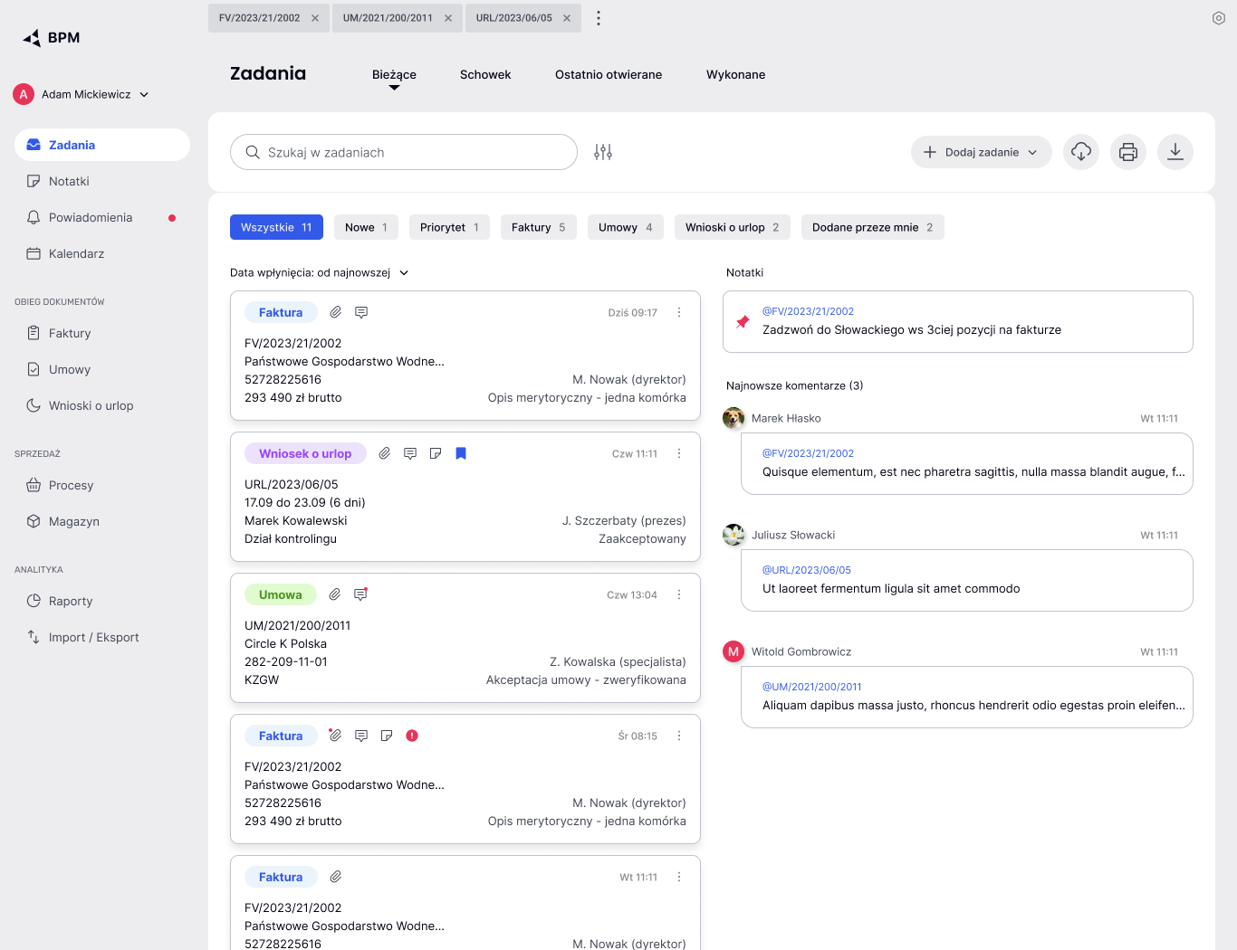
Task management
I designed new app section allowing users manage assigned tasks (screen below). Task list is visible directly after user logs in. Cards display basic information about tasks, indicate comments, attachments etc. Lists can be filtered and sorted.
Beside list of tasks this page show latest comments related to active tasks and pinned users notes (also new functionality).

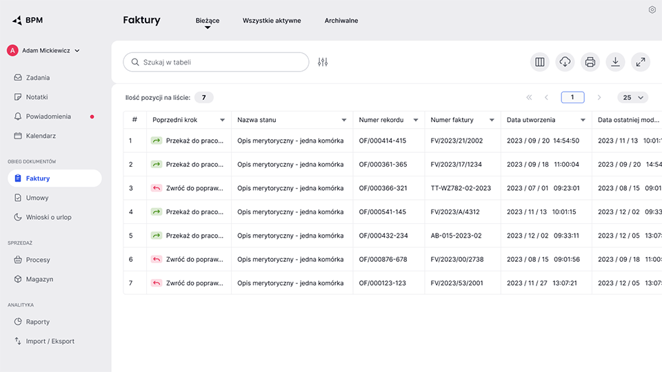
Tables
New tables are lot easier to scan and read data (screen below). Tools and additional informations are distinctive and consistently placed.
Data in table easily sorted by just clicking on column header, without the need to access column menu (1 click - AZ, 2 click - ZA, 3 click - reset - also new funcionality). I added new, permanent column with ordinal numbers - it allows to immediately notice if the data are in default order or not.
Advanced search is grouped in one new functionality, accessed through button next to the search field (in current version advanced search filters are hidden in columns menus).
I also added new tool for managing columns visibility and order.
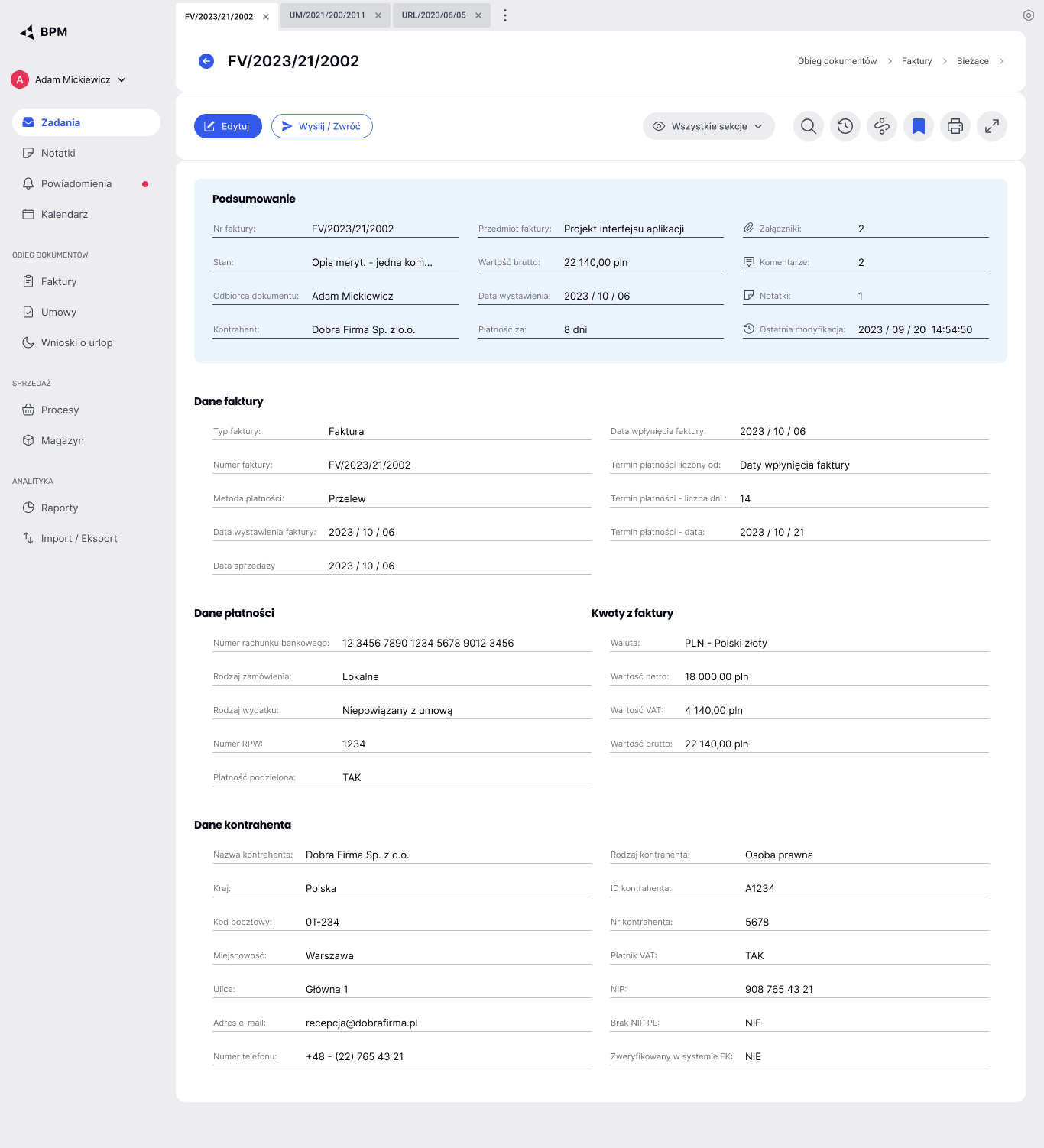
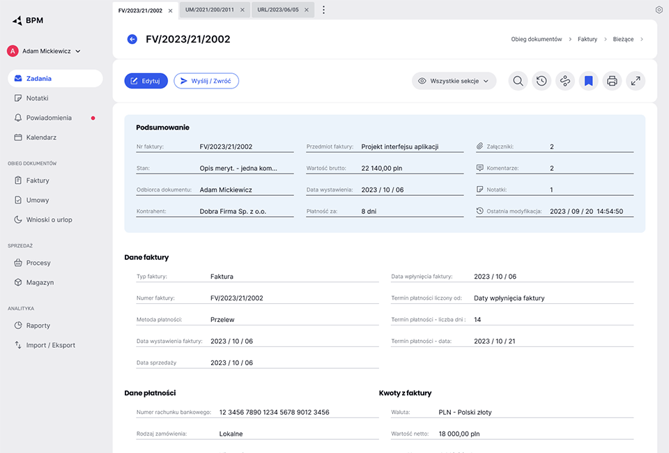
Documents
Open documents are now available in tabs always visible at the top of the screen, without necessity to first go to the relevant section of the app.
Document’s name/number is clearly visible, header displays breadcrumbs menu indicating where in the system document belongs.
As a default, documents are now opened in preview mode. It is more legible and easier to scan than form. First from the top preview displays recap of the document containing most important data.
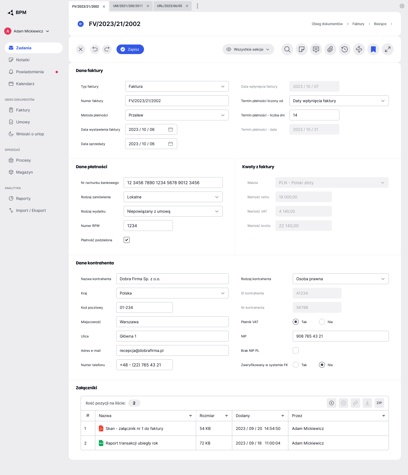
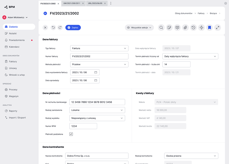
Editable forms gain more breath and are more legible. Fields wich can’t be edited by user are clearly disabled.
Both preview and forms are responsive. In both modes user can display all document sections, several sections or just one (new functionality). Isolation of one or few sections makes easier to focus on editing and avoid errors.
User can “bookmark” documents to easier find them later, and create notes pinned to particular document (new functionalities).
* All data, names, menu items and form fields are completely random, used only to illustrate new GUI.